Analyse data with graph and pivot views
What this does
A list answers “which records?”. A report answers “how much, and which way is it going?”. Most applications in WindoorERP have a Reporting menu, and behind it the same two general-purpose views: the graph, for seeing a shape, and the pivot, for taking a number apart. They share a search bar, they share a measure list, and they answer the same question in two registers.
Neither view holds any data of its own. A report is nothing but the search that produced it, aggregated — which is why the first thing to read on any report is its search bar, not its numbers.
Before you start
- A report opens with filters already applied. Sales Analysis, for example, opens with Sales Orders and Order Date: Last 365 Days in the bar and cancelled orders excluded outright. Two people quoting different totals for the same report are usually quoting different search bars.
- Filter before you chart. A picture of the wrong records is more convincing, and therefore worse, than no picture at all.
- Only numbers can be measured. Everything else on the record can be grouped by, but not summed.
Steps
-
01
Open the report from the application's Reporting menu — for sales figures that is Sales › Reporting › Sales, which opens the Sales Analysis report.
-
02
Set the period and any other conditions in the search bar first.
-
03
Switch between views with the buttons at the far end of the control panel: the graph icon, the pivot icon, and whatever else that report offers.
-
04
Click Measures and choose what is being counted. In a graph you may have one measure; in a pivot you may tick several.
-
05
Add a Group By for the dimension you want to see it broken down along — by month, by salesperson, by product category.
Choosing measures
Measures is the blue button at the start of the toolbar. It lists the numeric fields of the report in alphabetical order, and then, after a dividing line and always last, Count — which counts records rather than adding anything up.
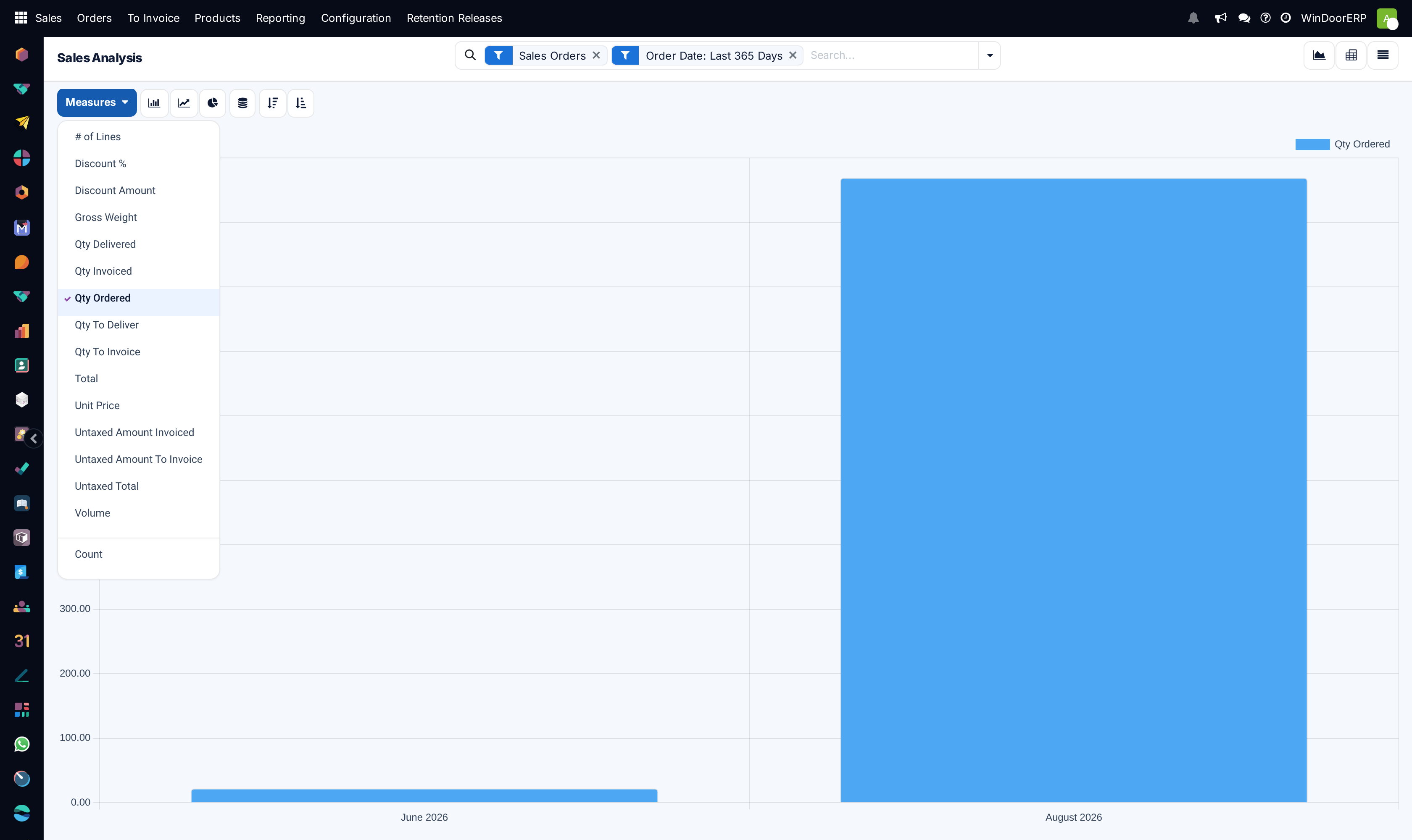
A field reaches that list only if it is a whole number, a decimal or an amount of money and it is defined as something that can be added together. That last condition is why a numeric field you can see on the form is sometimes not offered here: a sequence number or a reference code is a number, but adding two of them together would be meaningless, so it is excluded. Fields hidden by the report's own layout are excluded too.
The graph shows exactly one measure at a time — picking a new one replaces the old. The pivot shows as many as you tick, one column each. There is always at least one measure selected; on Sales Analysis the report opens on Qty Ordered.
Important
Read the measure before you read the chart. Count and a money total answer different questions about the same records, and each view remembers whichever measure you chose last — including when you come back tomorrow through a saved favourite.
The graph view
The graph is for shape: a trend, a comparison, a share of a whole. Everything it can do sits in one row of buttons above the canvas.
| Button | What it does |
|---|---|
| Measures | Chooses the single value being plotted. |
| Bar Chart | Columns side by side. The workhorse: it copes with many categories and it is the easiest to read accurately. |
| Line Chart | A continuous line. For change over time, and the default on reports whose natural axis is a date. |
| Pie Chart | Slices of a whole. Only honest when the categories are few and genuinely add up to something. |
| Stacked | Offered on bar and line charts. With two group-bys, the second is drawn on top of the first rather than beside it, so the height is the combined total. |
| Cumulative | Offered on line charts only. Each point adds the ones before it, turning a series of monthly figures into a running total. |
| Descending / Ascending | Sorts the categories by their value. Not offered on a pie chart, which has no axis to sort. |
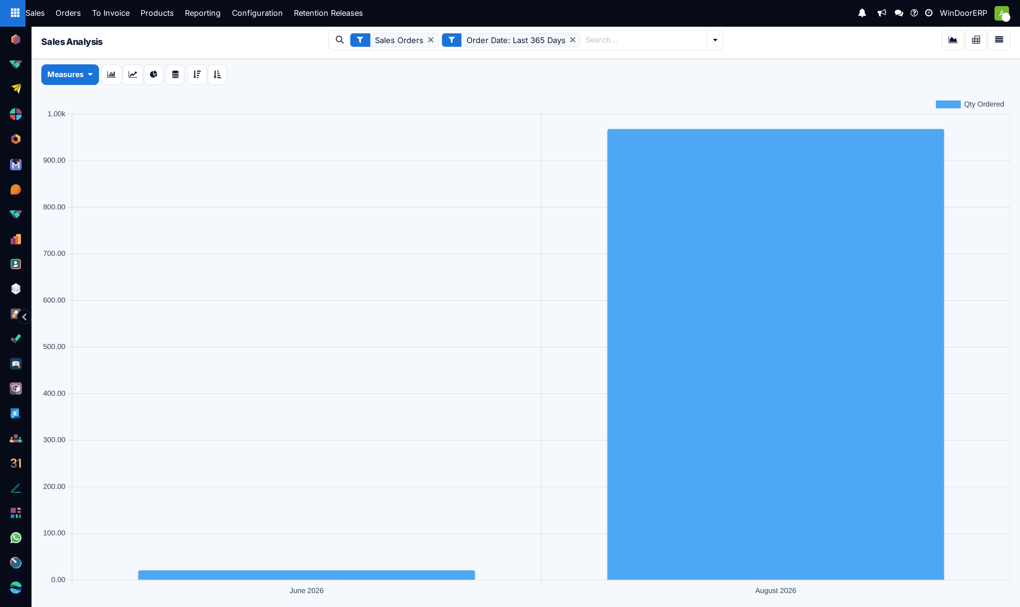
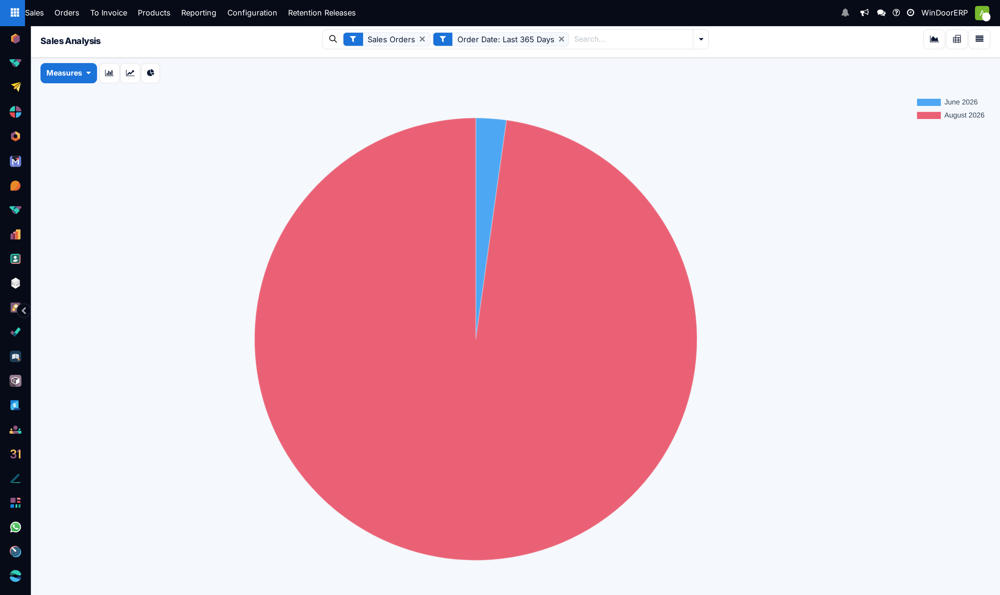
The chart is not just a picture. Hover any bar, point or slice for a tooltip with the exact figure — on a pie it also gives the percentage. Click the legend entry for a series to hide and show that series. And on a bar or pie chart, clicking a segment opens the underlying records as a list, so you can go from “that month is wrong” to the four orders that made it wrong in one click. On a line chart clicking does nothing — that is deliberate, not a fault.
Note
Two messages come from the graph itself and are worth recognising. “There are too many data. The graph only shows a sample. Use the filters to refine the scope.” appears once a chart would need more than eighty series; a link beside it, Load everything anyway, overrides the limit at the cost of a slow, unreadable chart. And “Pie chart cannot mix positive and negative numbers” replaces the chart entirely when a measure contains refunds or credit notes — a pie has no way to draw a negative slice, so filter them out or use a bar chart.
The pivot view
The pivot is for taking a number apart. It is a table with groups down the rows, groups across the columns, and the measures where they cross.
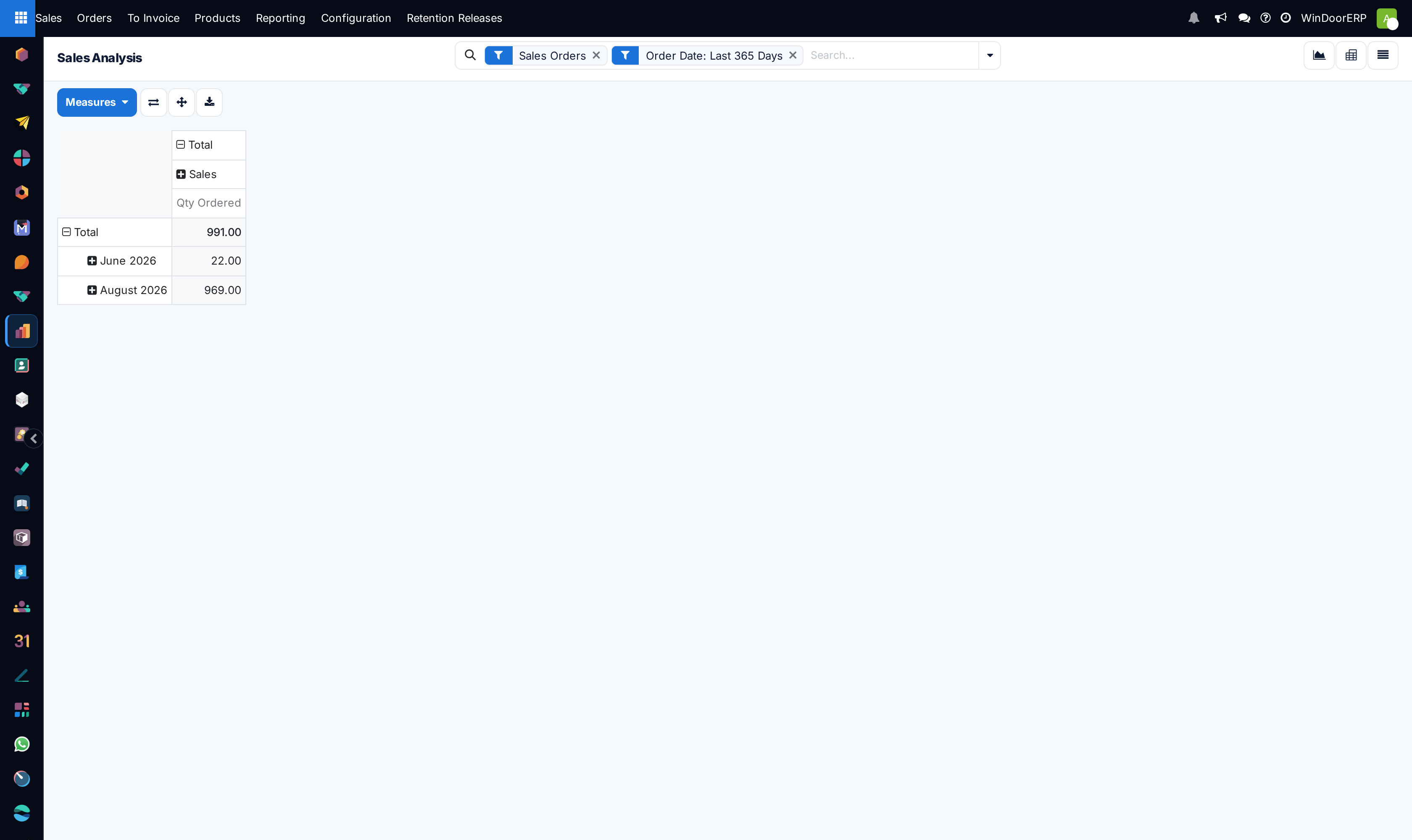
Both axes start collapsed at a single cell reading Total, with a small + beside it. Click that + and a menu of groups appears — the same list as Group By, plus Custom Group for anything else on the record. Choose one and the axis expands. The + on any of the new headings expands that heading further, so you can drill into one product category by month without touching the others. A − collapses a heading again.
The three buttons beside Measures are:
| Button | What it does |
|---|---|
| Flip axis | Swaps the row groups and the column groups. The fastest fix for a table that has grown too wide to read. |
| Expand all | Opens every heading on both axes to their full depth at once. |
| Download xlsx | Exports the table exactly as it is on screen — the groups you opened, the measures you ticked — as a spreadsheet. |
All three are greyed out when there is nothing to act on: no records match the search, or you have unticked every measure.
Clicking a measure column heading sorts the rows by that column; a small caret shows which way, and clicking again reverses it. Clicking a value cell opens the records behind that one figure as a list. Where a cell has had to add up amounts in more than one currency, a small ? appears beside the number; hovering it shows the breakdown.
Tip
The pivot is the honest place to check a chart. If a bar looks wrong, switch to the pivot with the same search bar, expand the axis, and read the number — then click the cell to see the records themselves.
Keeping a report you built
A report you have set up is worth saving. Open the search drop-down, click Save current search in the Favorites column and give it a name: WindoorERP stores not only the filters and groups but also the measures you ticked and, in a graph, the chart type and sort order. Tick Default filter and the report opens that way for you every time.
Sharing works from the same panel: click Edit instead of Save, and fill Shared with on the form that opens. Leaving that field empty shares the report with everyone rather than keeping it private.
See also
The search bar, its filters, its group-bys and its favourites are covered in full in Search, filter, and group records.
Worked example: the Sales Analysis report
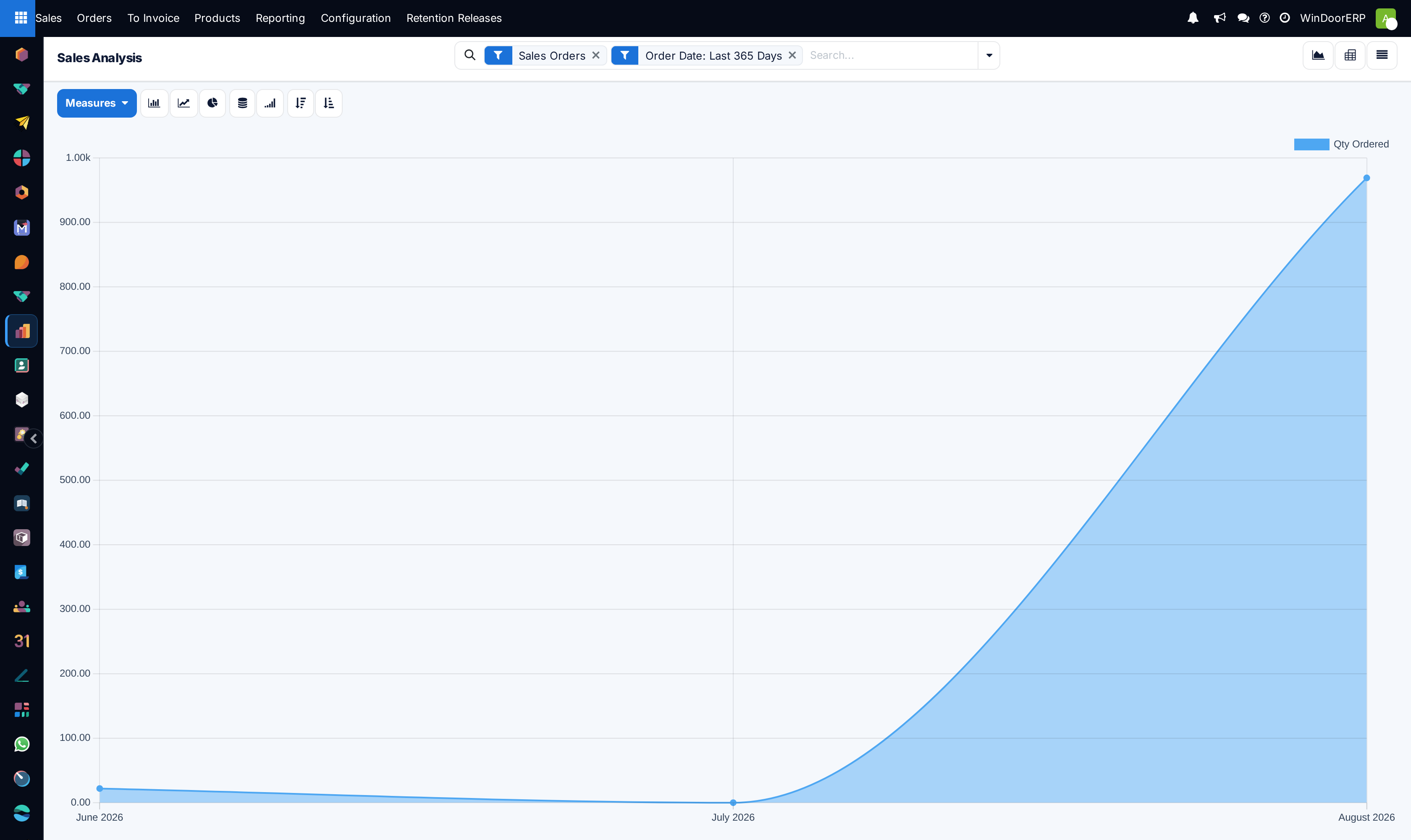
It helps to see one report in detail, because the defaults are rarely what people assume. Sales › Reporting › Sales opens the Sales Analysis report, and it opens:
- in graph view, as a line chart — not a bar chart;
- on the Qty Ordered measure — a quantity, not a value, so the height of that curve is pieces, not money;
- grouped by Order Date at month granularity;
- filtered to Sales Orders and Order Date: Last 365 Days, with cancelled orders excluded by the report itself and quotations excluded by the filter.
Switch to the pivot and the same report lays Sales Team across the columns and Order Date by month down the rows. To read revenue rather than pieces, open Measures and pick Untaxed Total or Total; to bring quotations back in, tick Quotations in the Filters column alongside Sales Orders.
Troubleshooting
The numbers look wrong. Read the measure before the chart. A count of records and a sum of amounts answer different questions, and the view remembers the last measure you chose rather than resetting to the report's default.
A total does not match another screen. The two are filtered differently. Compare the search bars, not the totals — and check whether one of them is on an untaxed measure and the other on a taxed one.
A category is missing from the chart. Grouping creates a block only where records exist. Records with nothing in the grouped field land in a separate group, and a date axis simply skips periods with nothing in them.
“There are too many data. The graph only shows a sample.” The grouping produces more than eighty series. Narrow the search or group by something coarser — by quarter instead of by day, by category instead of by product. Load everything anyway is available but rarely the right answer.
“Pie chart cannot mix positive and negative numbers.” The measure contains negatives — refunds, credit notes, returns. Filter them out, or read the data as a bar chart, which can draw below the axis.
“For Excel compatibility, data cannot be exported if there are more than 16384 columns.” The pivot is too wide for a spreadsheet. The message names the three fixes itself: flip the axis, filter further, or untick some measures.
Clicking a point on a line chart does nothing. Drill-down is offered on bars and pie slices only. Switch to a bar chart, or to the pivot, and click there.
The pivot buttons are greyed out. Either the search returned no records, or every measure is unticked. Open Measures and tick at least one.
The numeric field you want is not in the Measures list. The field is not defined as something that can be added up — most reference numbers and sequence fields are not — or the report's layout hides it. Group by it instead, or use the pivot's Custom Group.
The report opened differently from yesterday. A favourite marked Default filter is being applied on opening. Clear the search bar to see the report's own defaults again.
Common mistakes
- Charting before filtering, and then defending the picture.
- Assuming the default measure is money. On Sales Analysis it is Qty Ordered, a count of pieces.
- Comparing two reports whose search bars are not the same, and concluding the data is broken.
- Using a pie chart for a dozen categories, or for a measure that can go negative.
- Exporting a pivot without expanding the groups you needed — the spreadsheet contains exactly what was on screen, no more.
- Reading a stacked bar as though each colour started from zero. In a stacked chart only the total height is measured from the axis.
- Sharing a screenshot of a report instead of the favourite. A favourite carries the filters, groups and measures with it; an image carries an argument.
Was this article helpful?
Thanks — your feedback helps.
Running a window or door factory?
Ask for a demo